Cucina Mediterraneo in Frankfurt: Italian cooking in pictures
Published
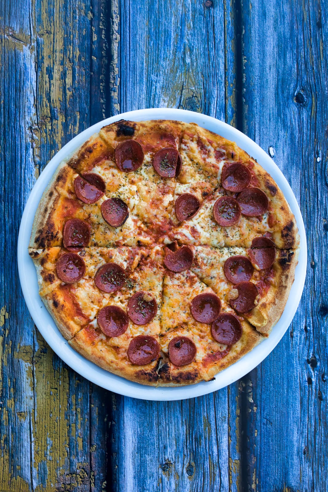
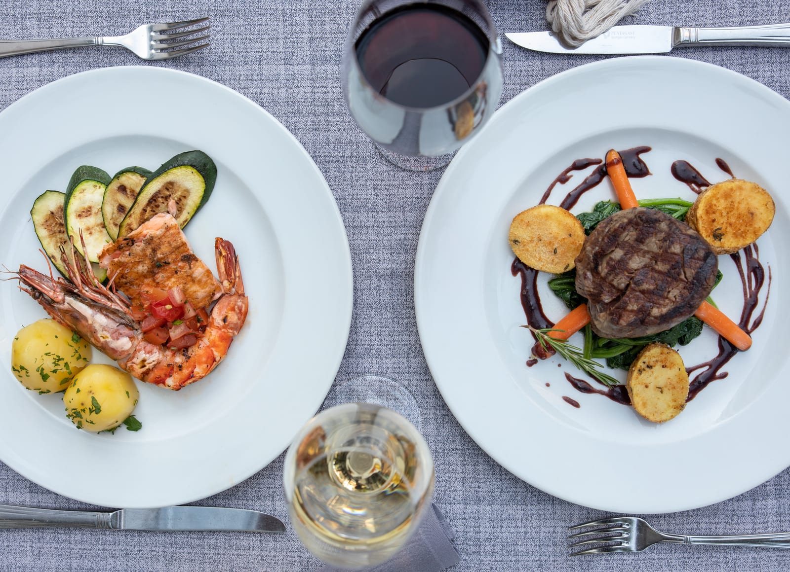
Two food series exist for Cucina Mediterraneo, and they do not look alike. One stands on a mottled gray linen cloth, the other on weathered blue wood.
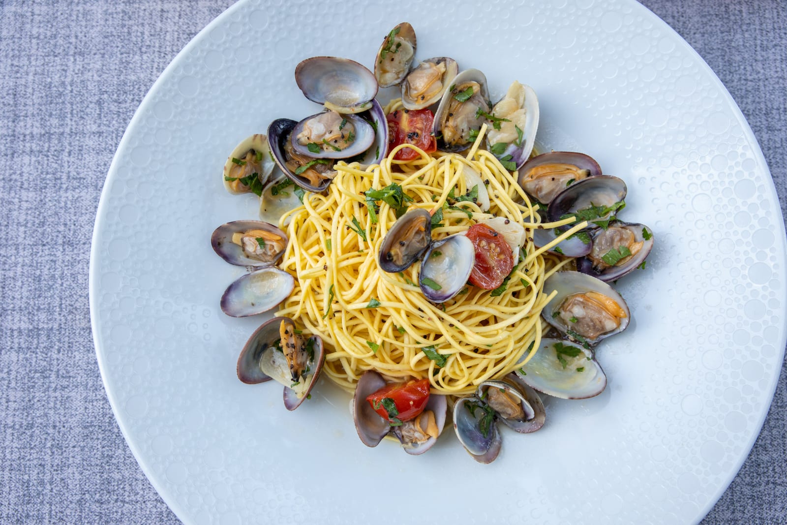
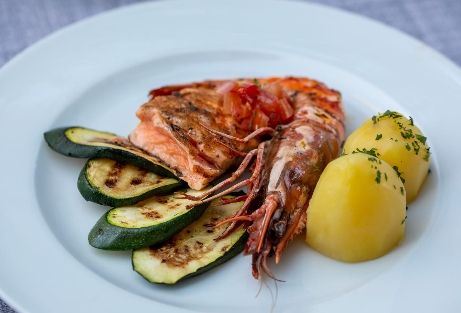
Both show the same kitchen: spaghetti alle vongole, prawns with zucchini, carpaccio, pizza, pasta, fish and meat. What separates them is a decision about the surface — and that changes more about the result than any ingredient on the plate.
The first series: mottled gray linen
Italian dishes are often built from a few clearly readable ingredients. In a photograph that simplicity is both an advantage and a risk: there is nothing for imprecise plating to hide behind.
The gray linen under the plates gives the series a quiet, constant ground. It has enough texture not to look empty and too little color to compete with the food. White porcelain lifts off it without glowing.
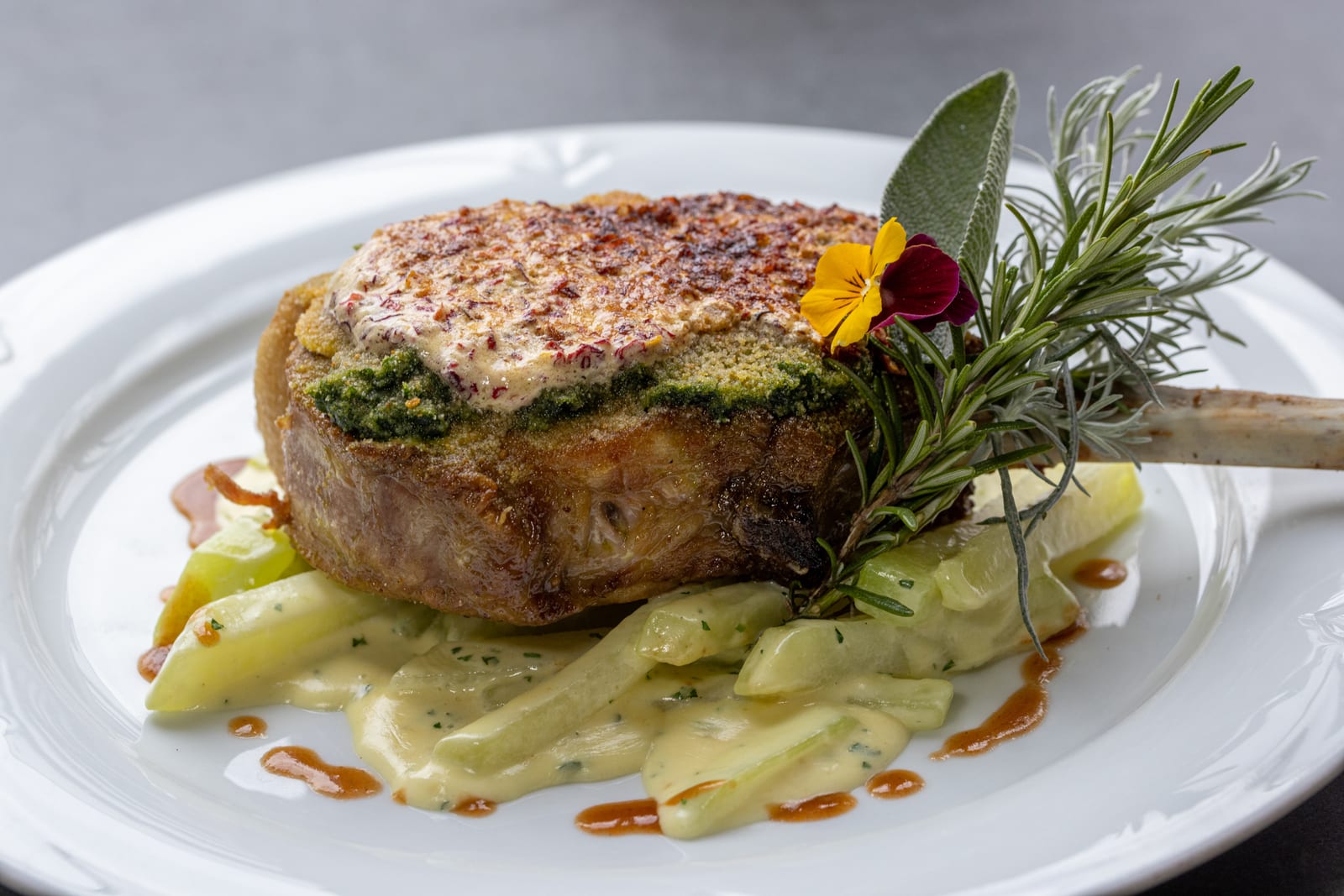
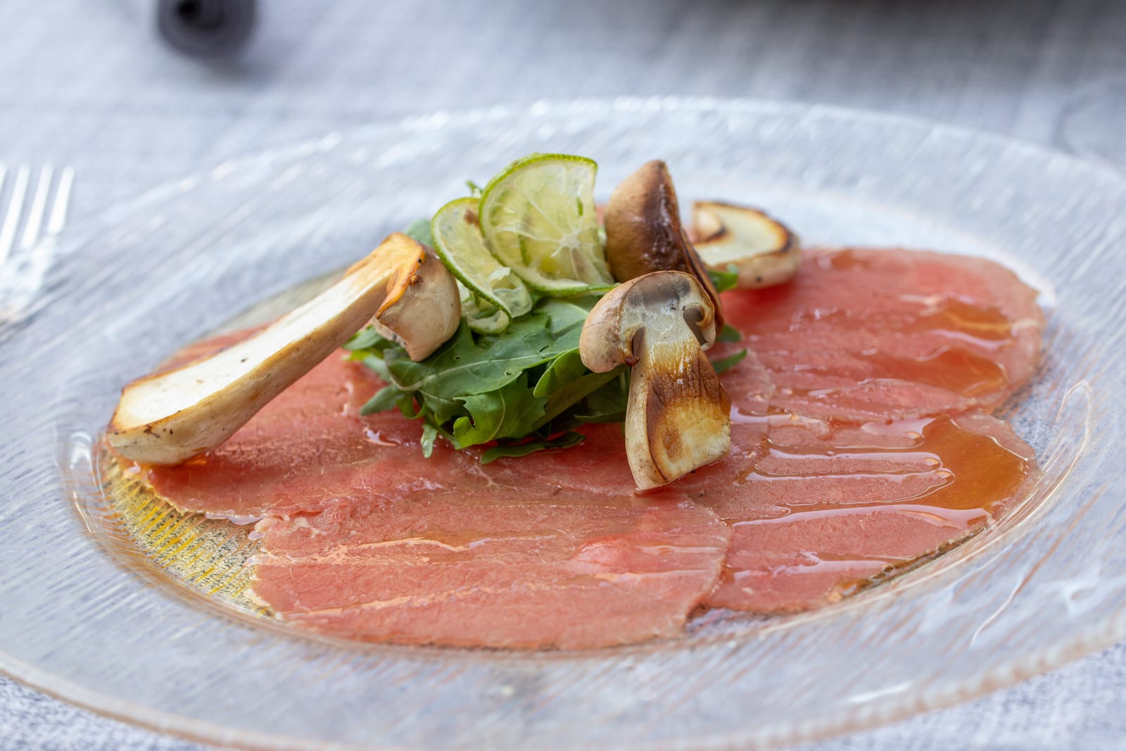
The light comes mostly from behind and to one side. It traces the rims of the clams, the shine on the sauce and the edges of the carpaccio — lit from the front, both dishes would have stayed flat.
Shallow depth of field keeps the eye on the plate
Part of the series was shot wide open. The near rim of the plate and the table fall away softly while the ingredient in question stays sharp.
That is more than an effect. A restaurant table is rarely occupied by one object alone, and cutlery, glasses or a second portion would compete for attention in a fully sharp frame. The blur decides where the eye lands first.
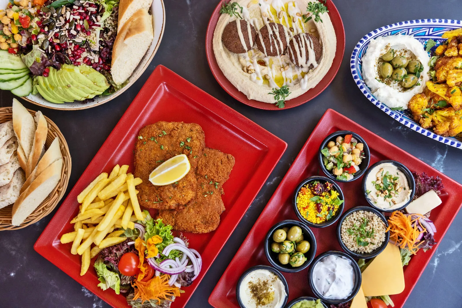
For the overhead frames it works the other way round: there the whole arrangement lies in one plane, everything stays sharp, and the order on the plate becomes the subject.
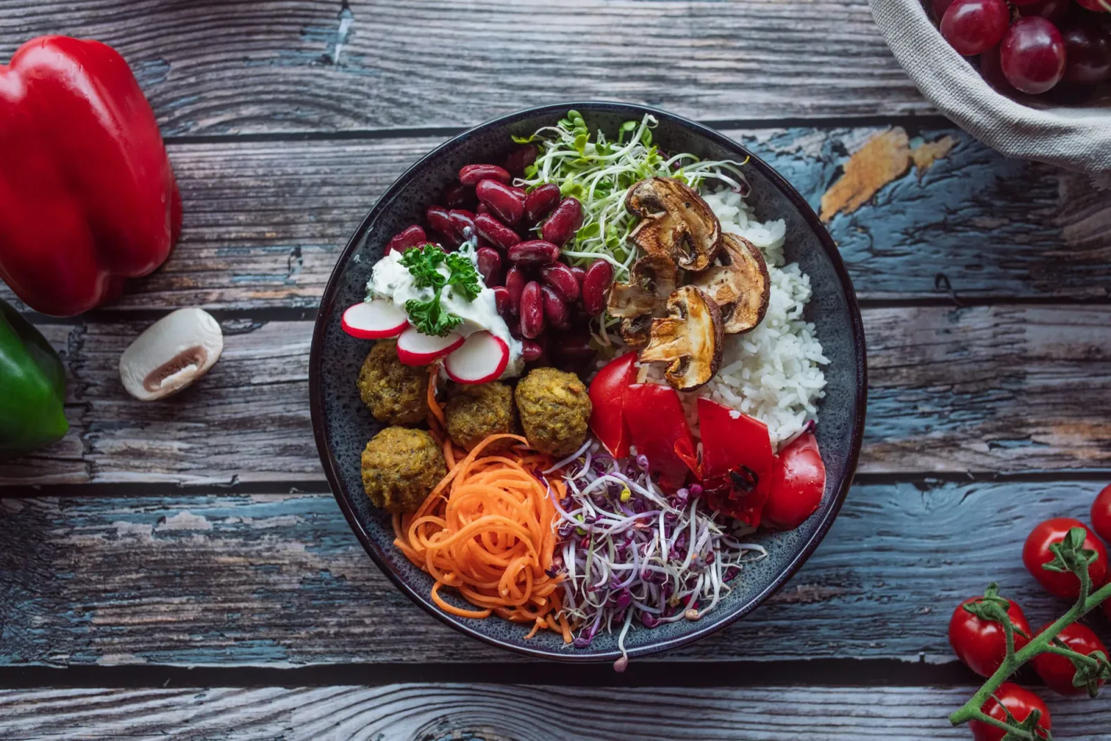
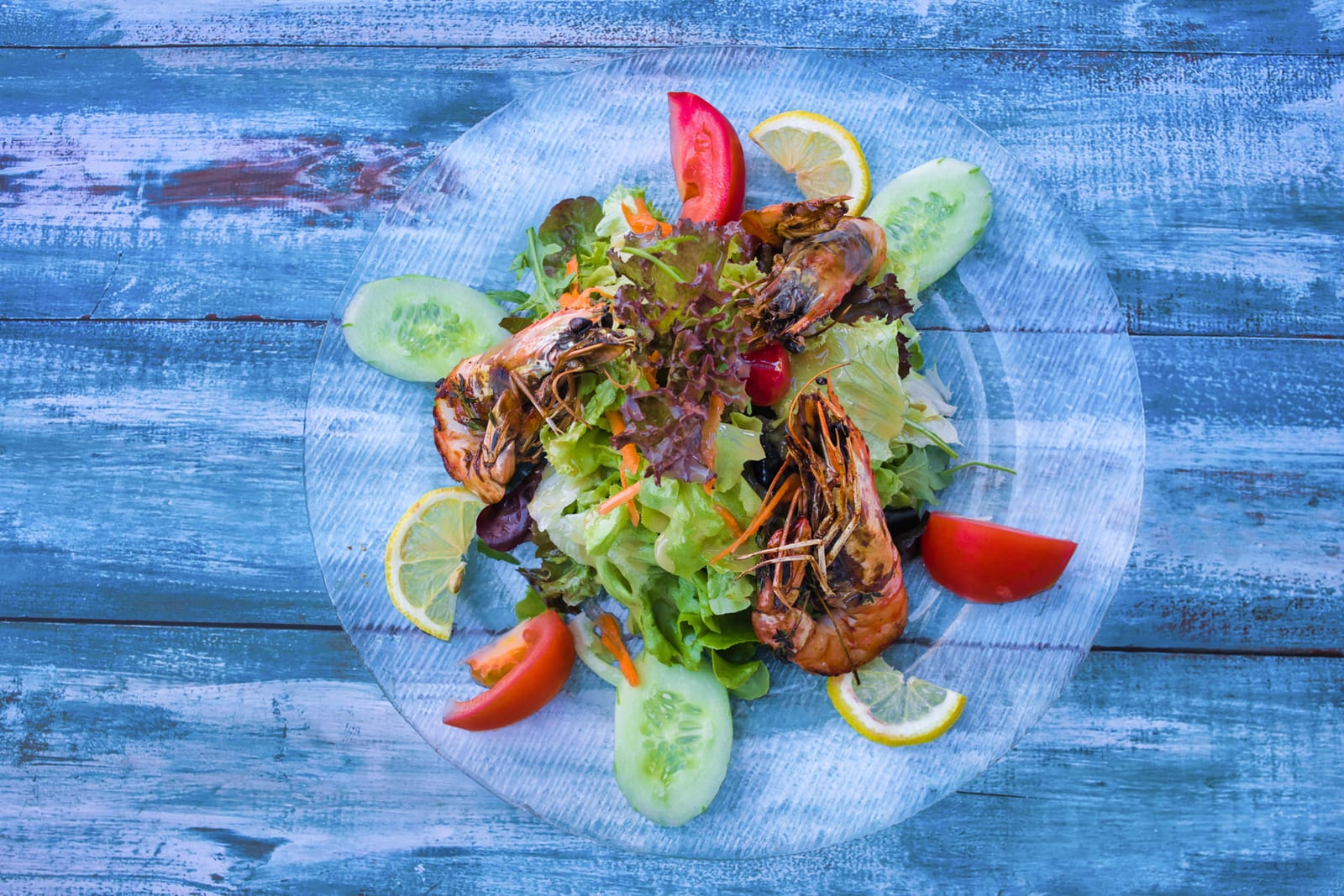
The second series: blue wood from above
The second shoot uses a weathered blue wooden table and photographs almost everything straight down. That changes the task: the subject is no longer the height of a dish but its arrangement.
Blue is the opposite of nearly everything on an Italian plate — tomato, oil, shellfish, baked dough. The contrast is strong and keeps even a restrained dish readable on a small screen.
Which is why this series carries better on social media, while the first one sits more quietly on a printed menu.
From both series
Why the surface decides the series
Put the two sets side by side and you see the same restaurant twice in two registers: once restrained and classical, once strong and graphic. Neither is more correct than the other.
What matters is that a house settles on one of them within a given use. A menu and a website in two registers read as two restaurants — and that is the most common failure when pictures from several years end up next to each other unsorted.
Want your dishes photographed?
Scope and price are fixed before anything is photographed or filmed. The inquiry commits you to nothing.