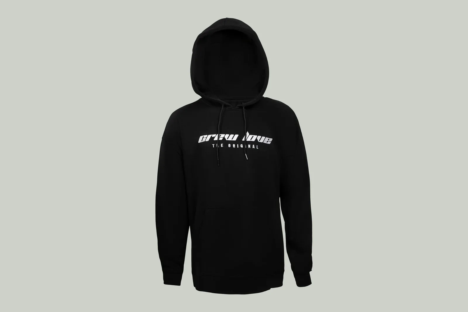
The same subject can appear on a website, in a brochure and on Instagram. The same file, however, does not automatically fit everywhere.
Website
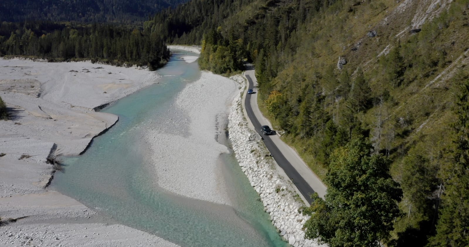
Web images have to load fast and fit the layout they sit in. Home pages often use wide formats, while team and service pages need different crops. What matters most is that the main subject and the person survive on a smaller screen.
Brochures, advertisements and large-format use need higher resolution and a suitable color space. The final trim should be known before an important subject is framed too tightly.
Shoot the empty space as well
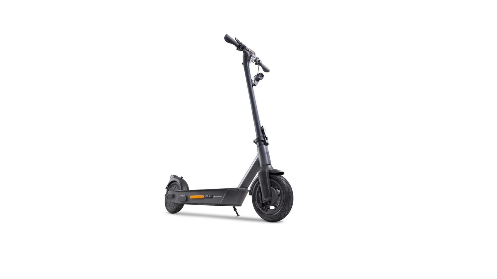
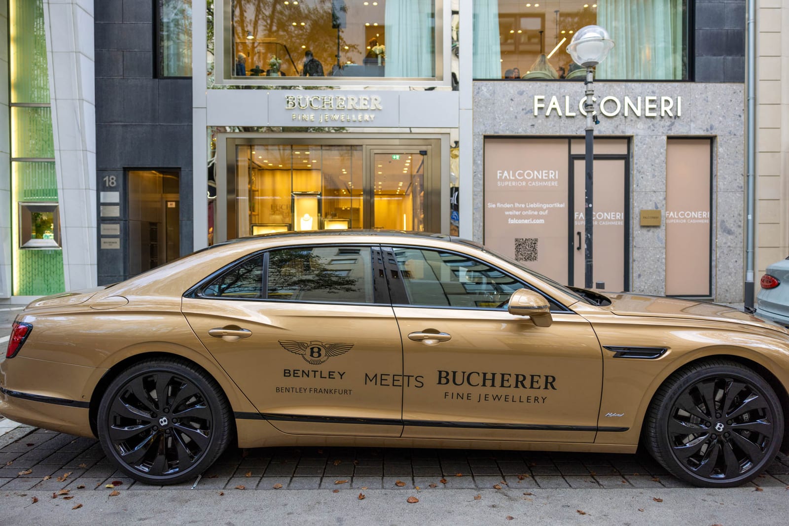
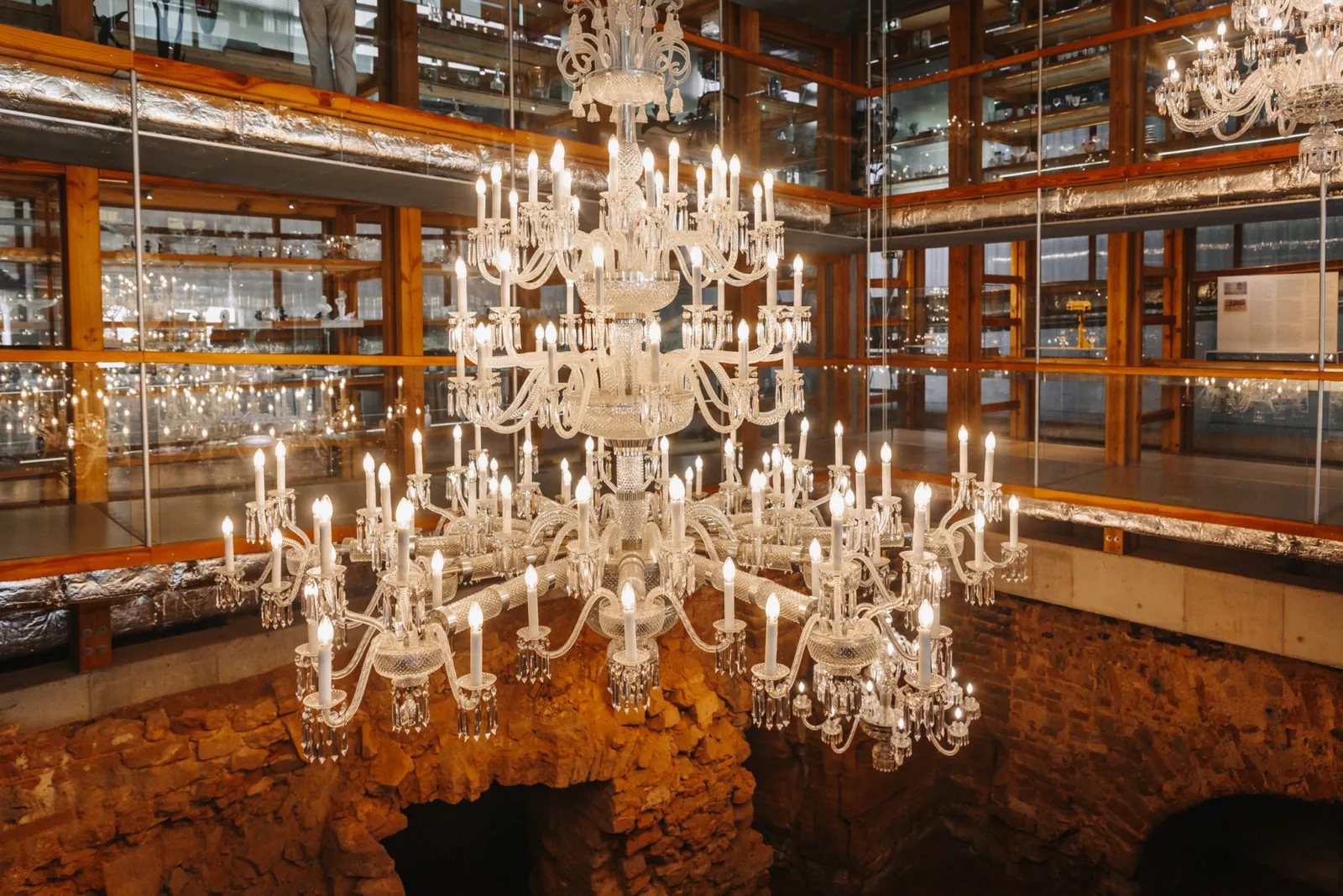
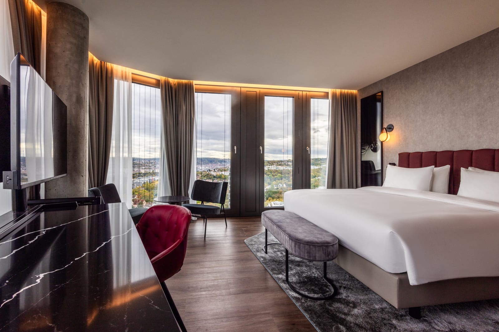
A picture meant for design work often needs deliberately calm areas. If every person is centered and the frame is filled to the edges, there is no room later for a headline or a different crop.
So during the production I plan several variants: tighter and wider, landscape and portrait, with and without free space. The visual language stays the same while the files do different jobs.
Decide beforehand instead of rescuing afterwards
The inquiry form asks about the intended use, the scope and the services you want. That information shapes both the shoot and the quote. Extra variants can be added later, but planning is the more efficient route.
Want your products photographed?
Scope and price are fixed before anything is photographed or filmed. The inquiry commits you to nothing.
Social media
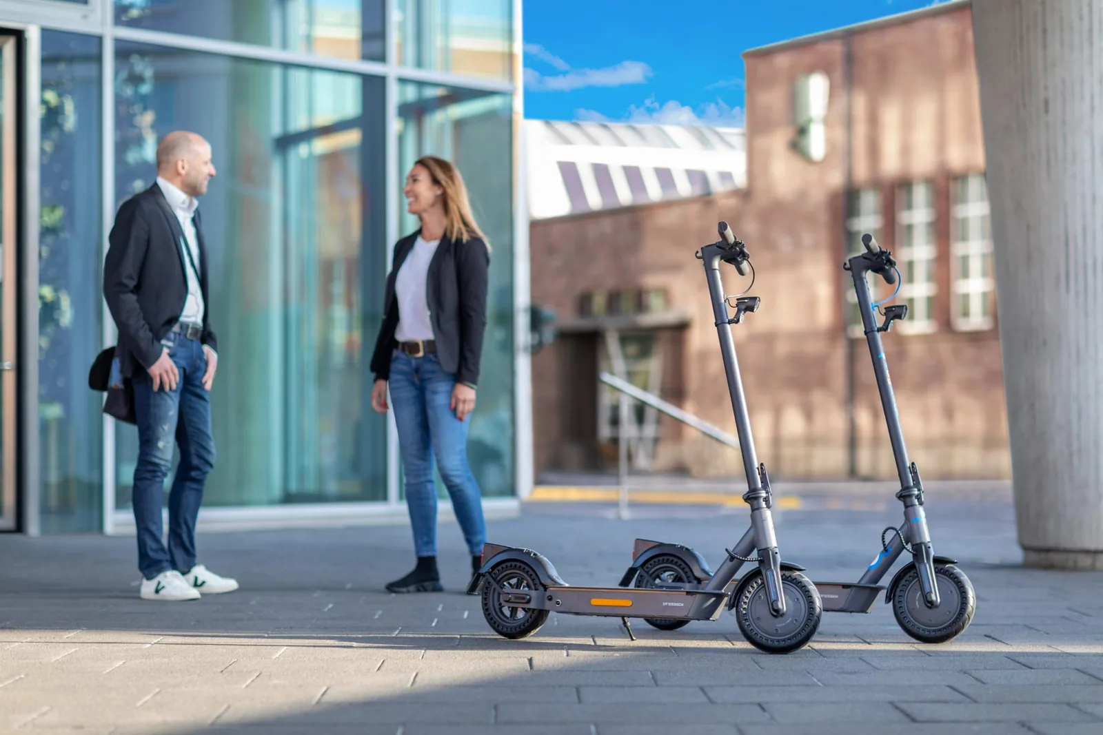
Vertical formats use the available screen better. Square versions can make sense for profiles and certain overviews. Text, logos and the platform’s own controls must not cover the important parts of the frame.